
One of the purposes for going camping and hiking at Caprock Canyons State Park was to work on my landscape photography composition. A landscape picture without thoughtful composition, is really a snapshot. This is fine for ‘evidence that I was there’ photos that you might put on Instagram, but I strive for something a bit more artistic. And I am an engineer that questions whether or not I have much of an artistic side. I have a lot more pictures from my trip that I will be posting on a future blog, but I want to concentrate on my efforts from the first day here.
There are some basic elements of good landscape composition that I have been studying. I try to discipline myself to take time and be mindful of these elements when out shooting instead of just pointing and hitting the shutter release when I see something pretty or interesting. I have had varying amounts of success as I get excited to be where I am and just want to photograph it all. I try to make myself just stop for a moment and take the scene in and live in it before grabbing for the camera. Then think about what will make a good photo.
- The first element to a good landscape photograph, is an interesting subject. It is really a pointless photo if it has no interest. I was in the middle of beautiful canyon lands, so I felt like I had a lot of opportunity for this.
- It is also important to tell a story about the subject, or capture the mood of the scene in such a way that it is evident to the audience. I have trouble with understanding this.
- A background can be the difference between a good photo and a horrible one. It can really bring out the subject, for instance hot colors vs. cool colors. Or maybe the background is the subject in which case you may need to work in a foreground to help it.
- The light in the scene is also very important. How it reveals the subject. What is not revealed. Where it is coming from. What color it is. My light was the sun so I had to deal with where it was and the clouds.
- Simplicity. If a photograph is not simple and too cluttered, it can just confuse the viewer and the message is lost in sorting out all of the extra detail
- A good landscape photo may have lines that lead the eye across the scene.
- Negative space can be used to balance a photo, and focus attention on the subject.
- There may be others, but this is what I am trying to work with here.
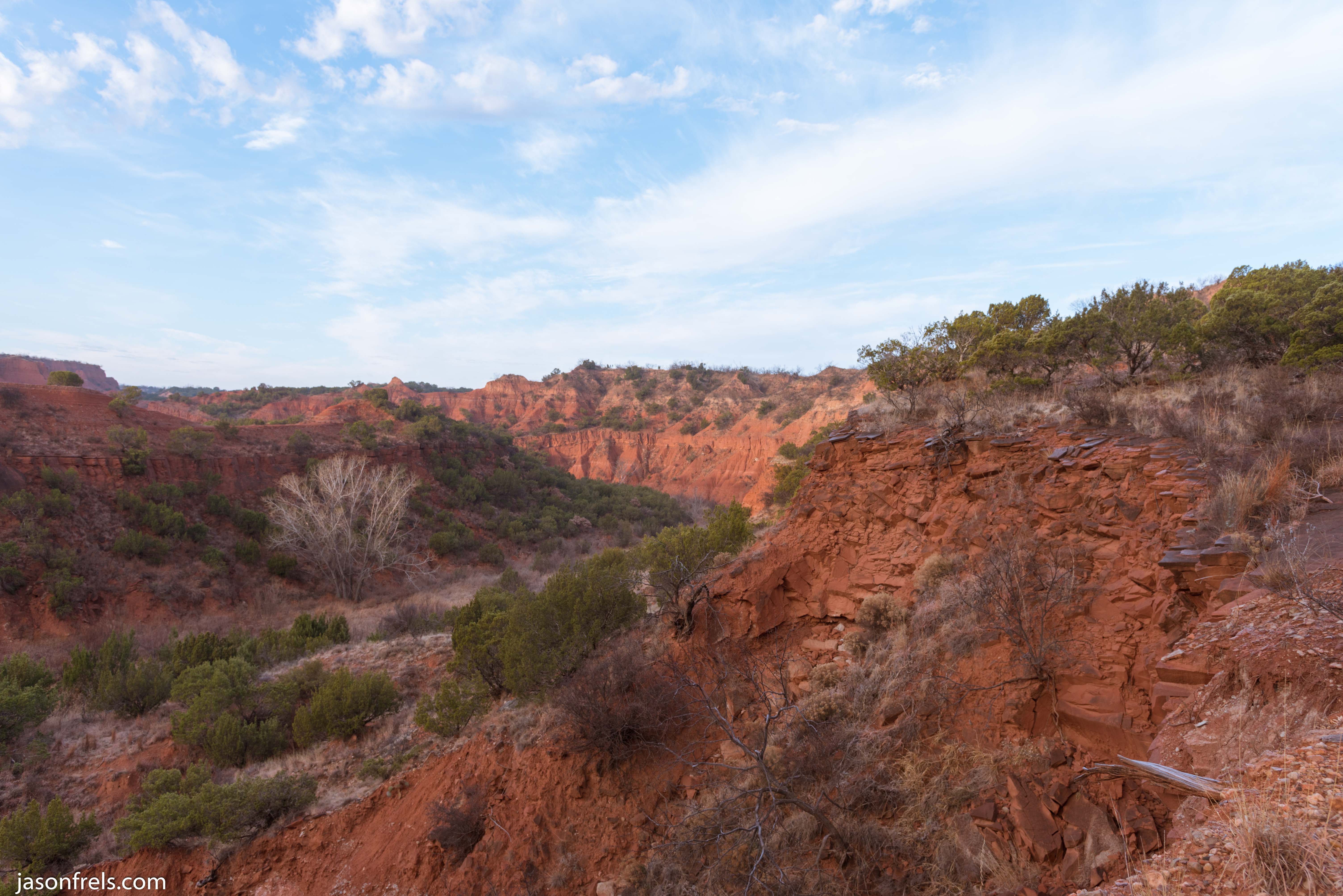
Sunrise over the canyons
First, there is this picture. The sunrise at my back shining on the cliffs across the canyon from me with a brightly lit juniper in the foreground.

What works? The canyons are an excellent subject and a beautiful subject. The tree in the foreground really pops, brightly lit by the sun. There is not a lot of clutter in the foreground to distract (simplicity). The cool blue sky contrasts well with the warm orange canyons (negative space). The morning sunlight is warm and compliments the red-orange cliffs (light)
What sort of works? The mood is a sunrise on a cold morning after a cloudy night (not sure if this reads). The line of shadow across the canyon roughly line up with a cliff line, that you may be able to see. But it is not very obvious. There is also the line of a stream running through the valley, but it is a bit swallowed by shadow.
What doesn’t work? This is a wide angle shot and scale can be easily lost with a wide angle lens. I had hope that the big tree in the valley would add scale but it is lost in the shadows, I think. While the light is beautiful and warm, it strikes the far canyon wall head on and the wall loses a bit of texture and depth. Perhaps I didn’t choose the best vantage point for this picture.
Cliffs Leading Across the Valley
Next I have this picture, which I took perched not far from the edge of a steep cliff. It was kind of scary, but I wanted the sightline right down the cliff’s edge into the distance.
Hopefully the eye would follow the cliffs into the scene as illustrated by the yellow lines below.

What works? It has the subject and some leading lines.
What doesn’t work? The clutter detracts from the scene (simplicity). The light is lacking due to clouds. There is a background, but really no foreground subject.
I still like this photo, but it is not a great landscape photo.
The Crevasse
With this photo, I wanted to capture the long, deep crevasse extending toward the pass in the cliffs.

The idea is simple and I think that I captured it well. The line of the crevasse take the eye to the pass.
The background is gray clouds. I should have come back the next day and shot this against the blue skies to contrast better with the orange cliffs.
The diffused cloud-cover light hides a lot of the texture and depth in this scene and makes it a bit flat.
I like this photo, but I think it could be better.
The Riverbed
I was a bit undecided on this picture. I wanted to get low to the ground and get all of the colorful stones in the foreground, but that kind of hides where the cliffs are headed in the distance. If I had moved over to the left, the stones would not be in the picture.
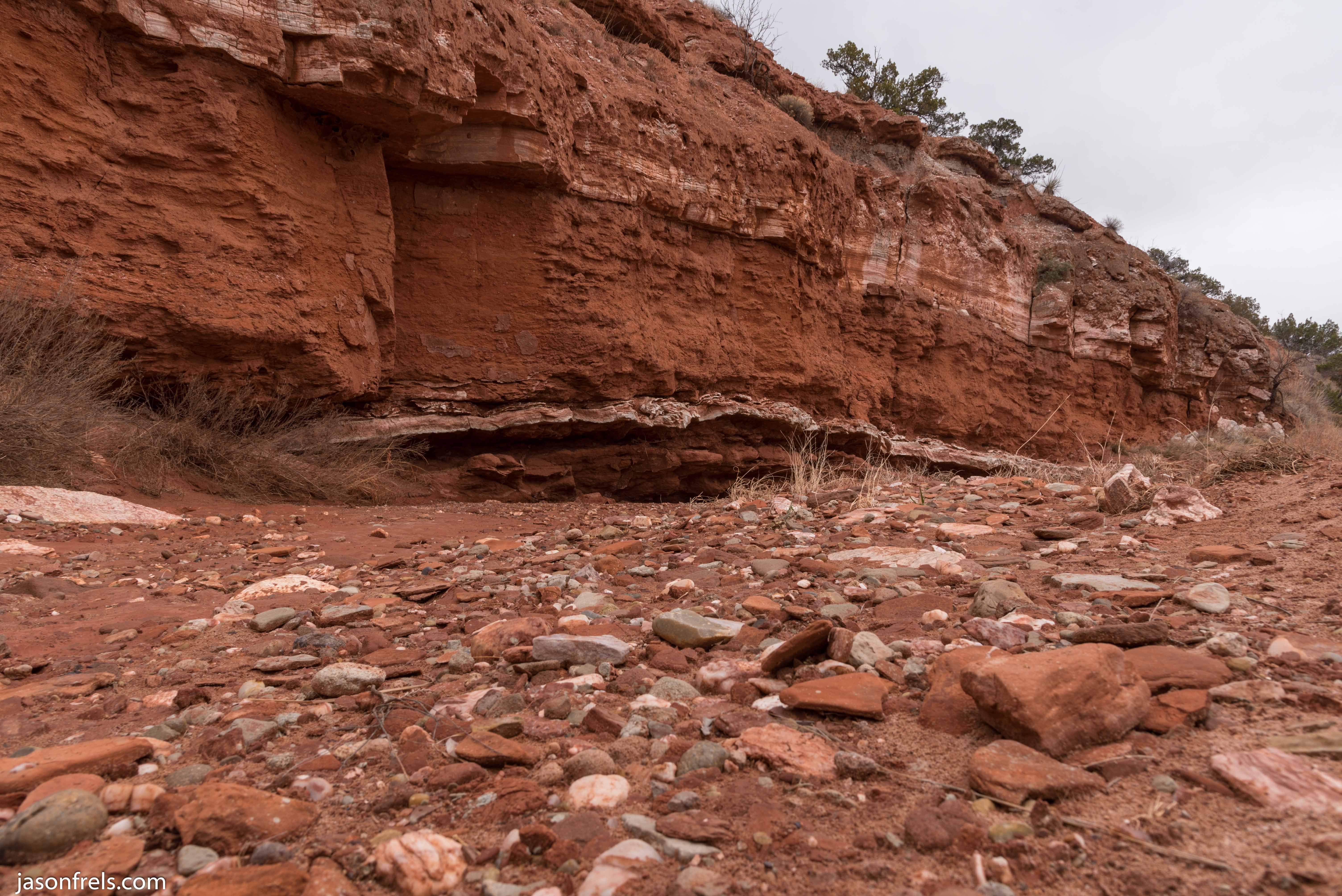
I think that the foreground stones are interesting. The different colors are not as evident in the flat cloudy light from above. Perhaps I should have spend more time in Lightroom. This picture is also quite cluttered.
The layers of quartz in the cliffs provide lines to lead across the scene, though their destination is obscured.
Probably not a winner.
In a few days, I will publish the photos that I had from day 2 of my trip. The sky was blue most of this day and I had pretty good, if windy, conditions.

Nice analysis.
LikeLiked by 1 person
I am trying to get better at this. There wouldn’t be much point if I wasn’t trying to improve. It is kind of hard to get good criticism, so I am trying to do it myself.
LikeLike